Case study: own portfolio
Documentation on the process of building my first portfolio. Things I learned and what's next.

We’re assigned to build our own portfolios as part of a lesson. Since we’re still in the learning process, I knew it would be challenging, and it felt awkward to build a website for myself. Even so, I knew it was a necessary step to become a web developer.
Here’s the process of how I built my first portfolio.
First off, I made style tiles, which can be described as a cross between mood boards and full mockups, to set the visual feeling of the website. Here’s my third try of a style tile:
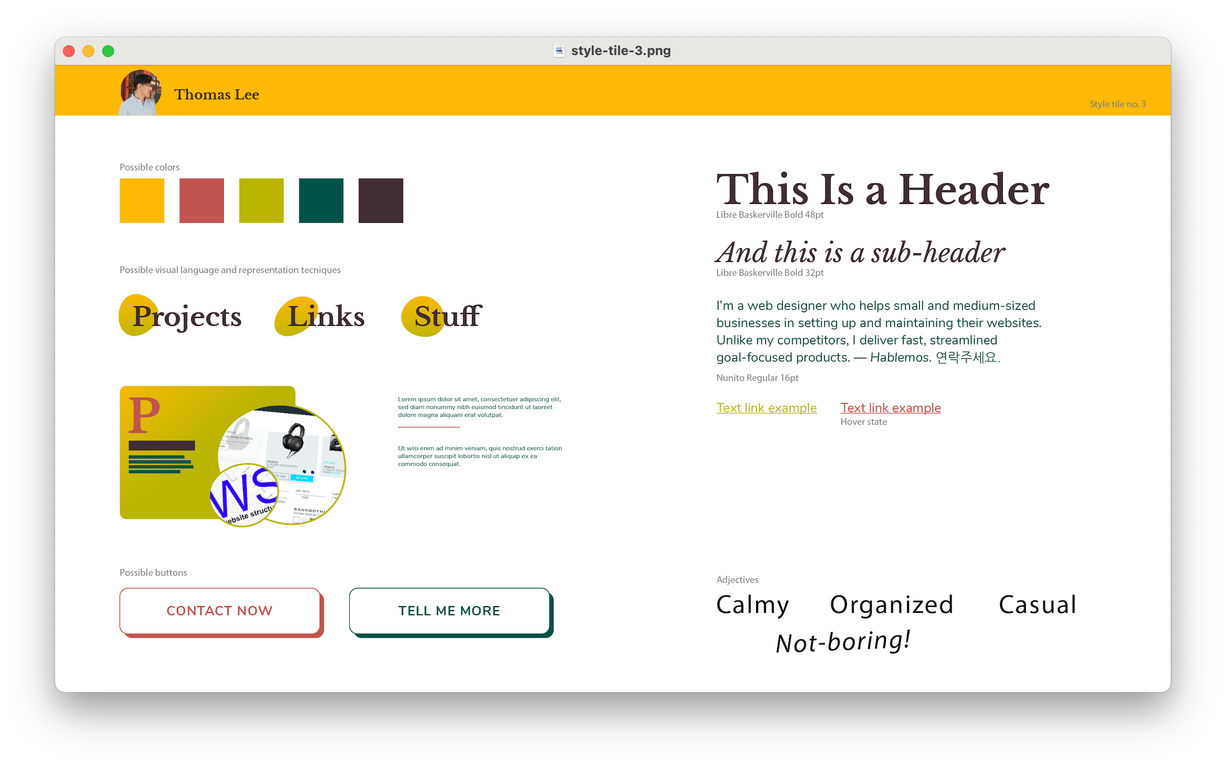
I loved it since I was inspired by one of my favorite fruits, the mango (yes!) The next step was to set a goal for the website. In this case, I wanted to showcase my projects, provide some personal traits on visual design styles, and offer my contact information. Since this was the first time building a personal portfolio, it had to be lightweight and straightforward.
If you didn’t already know, at Perpetual Education, all the students, including myself, are borderline obsessive about responsive design. It’s a must for the website to adapt to a phone, tablet, or desktop screen size. Even though I’m still limited in coding knowledge, I was confident that I would build something useful and something I would be proud of.
Thanks to my classmates, mentor, and wife's feedback, I was able to adjust the style tile. Here is the first trial:
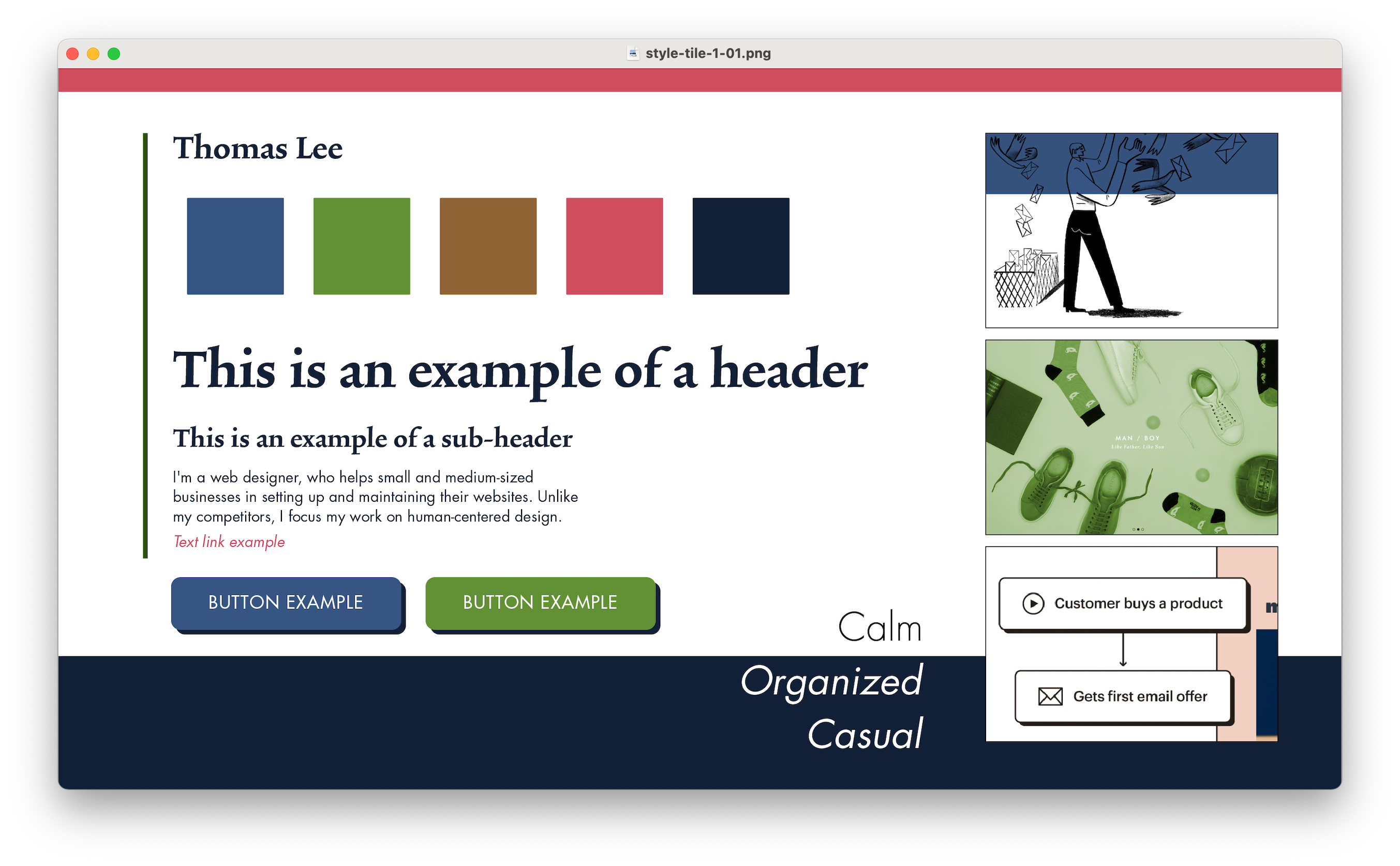
I wanted to define my style with those three main adjectives - calm, organized, and casual. But I also knew that I wasn’t going for something corporate, and at the same time, it shouldn’t be boring to the viewer. I decided to get rid of the deep navy and the color palette overall. I had some visual representation techniques in mind, so I started to research websites I liked for their visual qualities. On the other hand, my mentor noted that the buttons didn’t look “calm.” Consequently, I came up with the following:
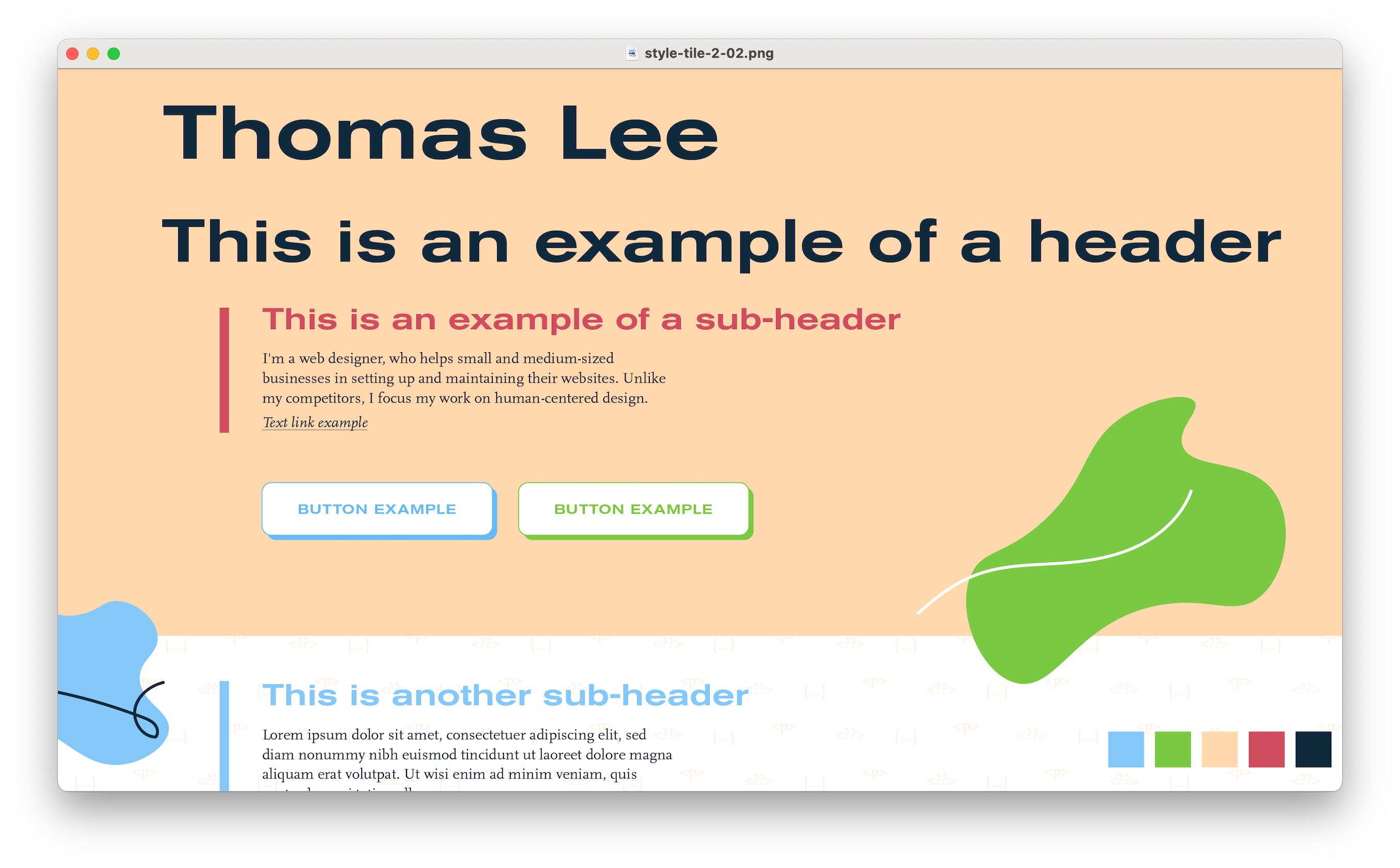
Did someone say “dropbox…”? Yes! I like their style. Between inspiration and copying, there’s a fine line. Anyway, once again, it was feedback time. My goal of representing “organized” was doubted by the class, especially because of the elements... Nothing looked aligned! Oops… I decided to eliminate the vertical lines and those organic shapes that made the website more “artsy,” something I had not planned.
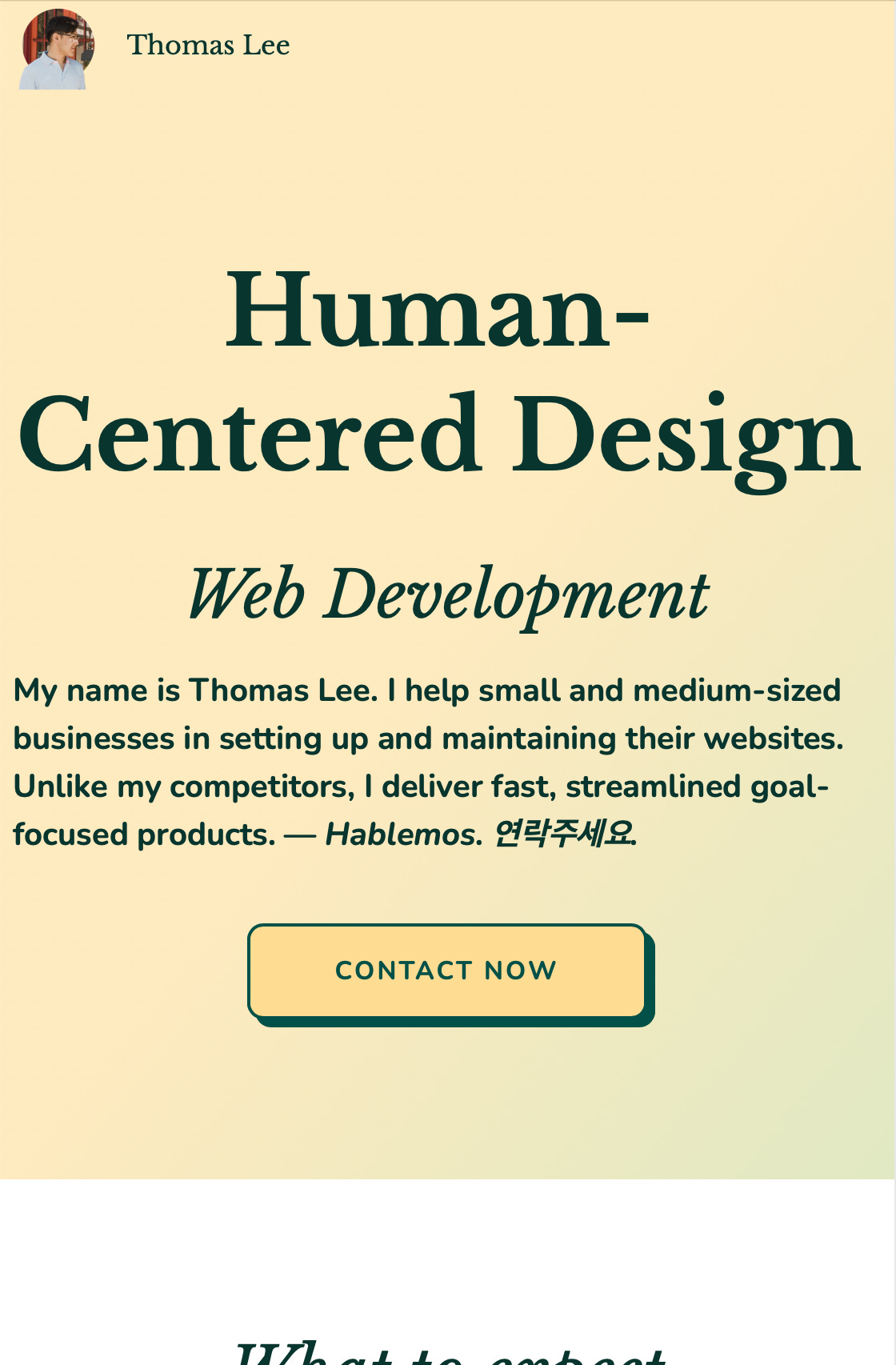
Once I had my visual direction set with the fruity third style tile, I proceeded to write the code with the main goal in mind: get leads. So I decided to show a contact button at the beginning. I also believed it would demonstrate my eagerness and transparency to communicate.
Next, I considered explaining to potential clients why they’d be interested in working with me. I selected three core principles to appeal to them.
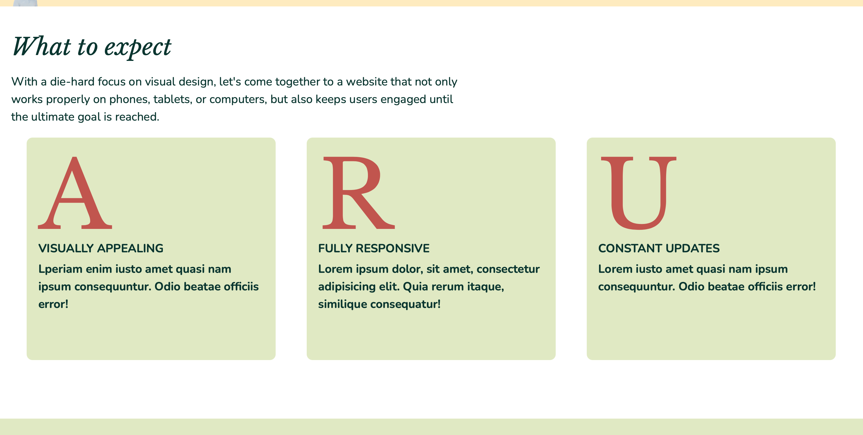
At this point, I’d like to mention the reason for the colors not being the same with the style tile. After several trials, it was clear that the original colors were just too saturated to the eye. For future iterations, I’m considering using more white backgrounds with colorful accents or smaller groups of elements rather than big colored sections. In fact, that’s the reason why the style tile works. Gladly, it resulted in overall good comments, especially from my wife!
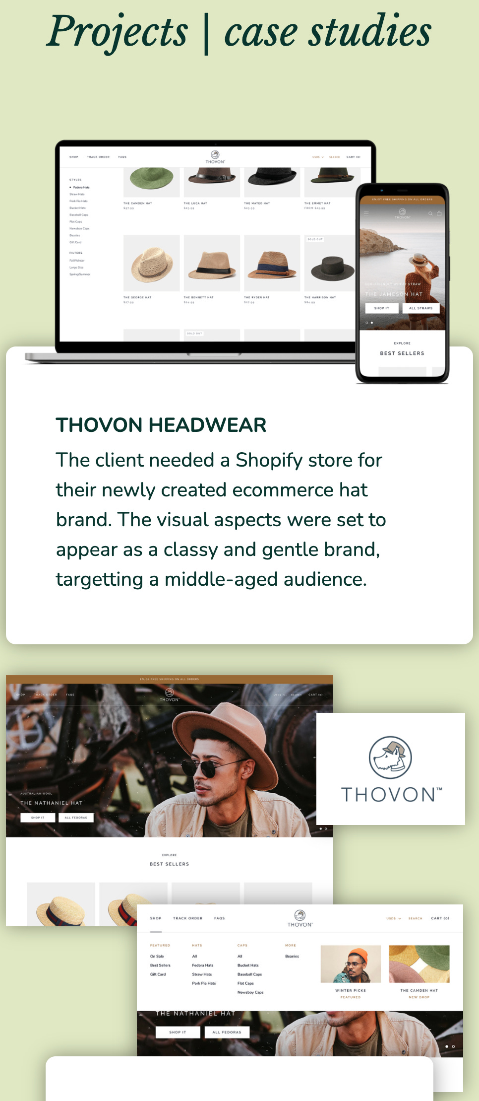
Lastly, I’d show the projects I had the privilege to work on, explaining in detail the decision-making process with case studies. This part is still under development. I’m working on making it look less like images screaming at the viewer and polishing it to have more finesse. The responsive breakpoints also need more work to make them more organized and purposeful. I’m planning to create more anchor points for the images to accomplish that.
Thanks for reading this long post! That must mean you’re interested. At this point, I’d love to hear your feedback about the website. You can access it here. Do you think it represents my three adjectives -calm, organized, casual- visually? What suggestions would you give me to improve it and make it more human-friendly?
great post tommy! I was hoping to see a collage of all three style tiles, so I can see your progress. Your website looks great! You have came a long way in a short period of time. Keep up the great work